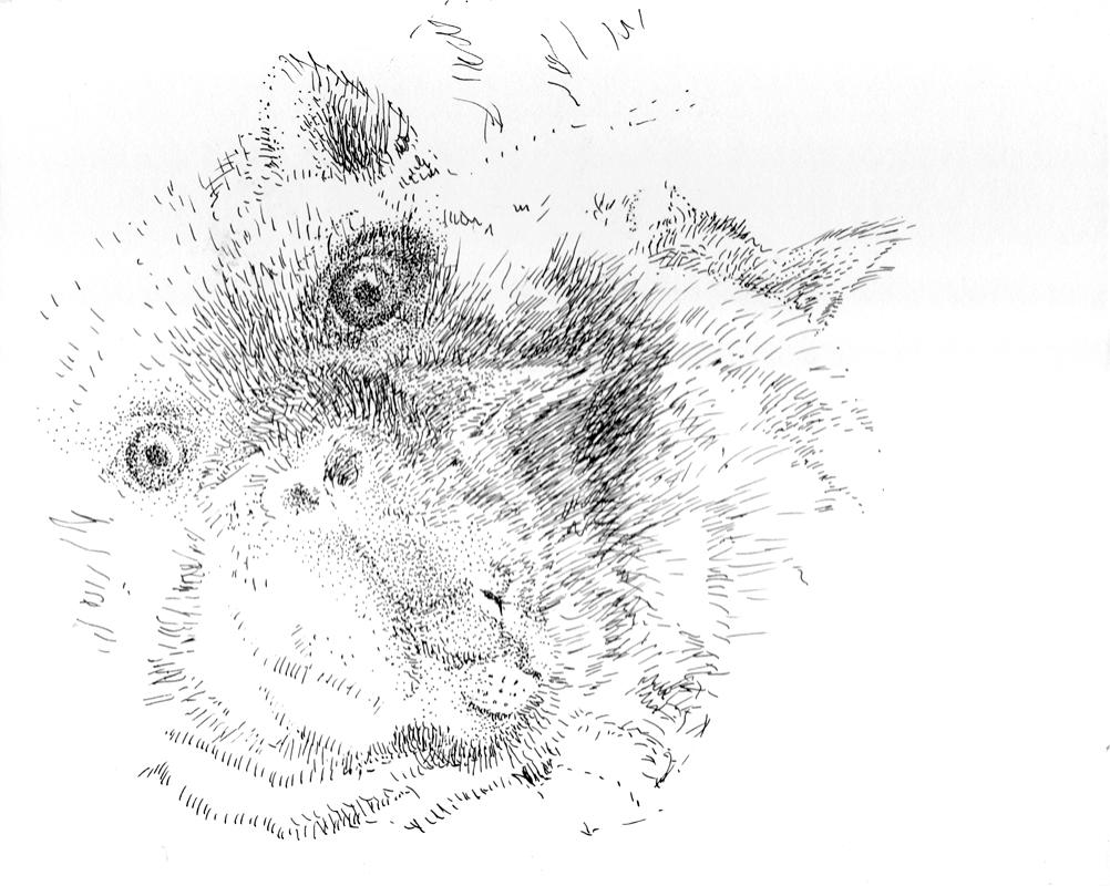
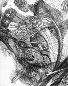
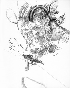
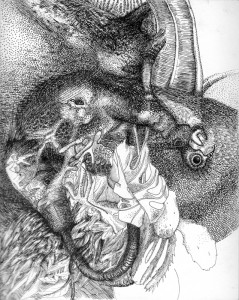
The drawing that begins this post is unfinished. It’s in limbo, as I decide whether it needs more work (it’s hard for me to leave things white). As its creator, it’s difficult not to smooth out the awkwardness and “normalize” both creatures to minimize the tension.
While I’ve long accepted that drawing is an exercise in putting up with ugliness & awkwardness, the awkwardness still bothers me. A friend once remarked that he felt that his paintings never went through an ugly stage, and that even when incomplete, he was generally satisfied with how they were progressing. I didn’t get it–was this like a parent who was sure that their child never misbehaved? Admittedly, I got ideas from the ugly stage of my work, and it usually worked itself out, either because I trashed the piece without damaging my artistic self-worth, or because it turned into something worth keeping.
Or sometimes, it’s because the awkwardness is interesting. I can’t imagine drawing a teen and not having it show in her features, or in how she holds herself. In the case of the drawing that begins the post, the creatures compete for attention, creating an awkward composition. I can accept that, even if it rubs me the wrong way.
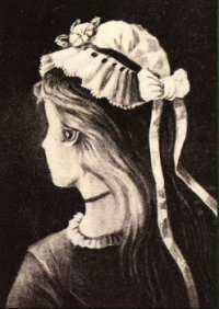
In future, I’d like to create an image that can be clearly read three or more different ways. When I was younger, I liked the young woman & crone images. I liked the clear morality, but it bothered me that the old woman was more interesting than the young one. It seemed unfair that the contours of the old woman’s face were sacrificed to make the young woman more attractive.
Now I feel that the dichotomy is heavy handed, even as I reproduce it on my own terms, with the models at hand. (Bogart, the cat who posed for the drawing, is currently ignoring me.)
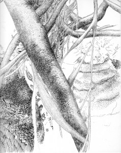
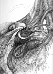
So far, my pen drawings of the past year have morphed between forms organically, so that they look more like dreamscapes than optical illusions, even less tied to reality than the image featured at the beginning of the post. People can find the drawings off-putting if they primarily appreciate art technically, searching in it for things they recognize. They don’t seem to get past whether something is a desk lamp or an eel.
With thematic illusions, like the girl/crone image, the compression of space is not an issue, as it can be rationalized. The Cats less so. The viewer has the same experience of flicking between views, without an intellectual reason for it. And it’s awkward sitting with tension.
